WORKING... FINALLY!
Is it possible to build a web application that really fits people needs? Of course you can: to know what people need you must ask them.
This is how the idea of WorkOutLoud - a new product built with ruby on rails - was born.
WorkOutLoud will share its construction process on the web with the users.
Do you want to know what WorkOutLoud is all about?
Do you want to know what WorkOutLoud is all about?

Nov 29, 2008
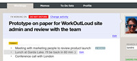
Mix CSS and images on a web page
Designing a web page can be really easy, but when you have to implement it using XHTML, CSS and pictures, to get a perfect mix, it’s a lot less easy. Also a small part of your page can become really difficult to build in, especially if you want to get exactly what have been designed with a graphic design tool. One of the tough tasks is to mix up correctly colors in the CSS and in the pictures you have included in your pages.
Today I will discuss how to correctly include a picture in a text page making it completely integrated.
There are some considerations to be done and rules to be followed:
Colors. The same color is displayed differently on a style sheet compared to a picture.
Browser. The same color can be displayed differently on different web browser
Formats. Pictures can be stored in different formats, such as jpg, png or gif. Different picture formats make the same color looking slightly different. So, you have to make use of the same format for all the images you put on your web pages. It's really important, especially if the colors you are using are not "web safe".
If you are forced to use pictures and a style sheet tightly integrated on a page, you have to decide how to make their colors displaying identical. Let's go through a small sample.
Working on WorkOutLoud I had to implement this portion of a page:
In the previous image there's a portion on the right side where the light blue rectangle change shape and goes over the beige rectangle:

Now, this design have been made using Apple KeyNote in a few minutes. It didn't take time to me decide that the metaphor I used was ok and that it looked pretty nice too. In my CSS the two rectangles were colored using the "color: " attribute, and the arrow shape was an image. So as a first solution I tryed with an arrow shape transparent on blue side - in order to get the same blue from the background of the rectangle - and the beige side colored directly on the image. In this way I got something like this:
The final result was not really good: the beige side of the arrow image was looking differently from the beige on the backgorund. Of course I could try the other way around: leaving the beige side transparent - in order to get the color from the background rectangle - coloring the blue side, but I could assure you that I would get the same result.
The real problem is that colors appearance strictly depend on the render method you apply to show them up.
So, how do you solve this kind of problems? How do you correctly merge styles and images?
Actually is really simple, and many of you already know the answer. In a case like this the image has to win, and the best thing you can do is coloring the beige rectangle using the "background-image" attribute in this way:
...
background-image:url(one_pixel_beige_image.png);
background-repeat:repeat;
...
Of course the "one_pixel_beige_image.png" must be a pixel with the same color as the beige side of the arrow image.
This small trick solved my problem.

Nov 22, 2008
MacBook Air thoughts
I finally bought a MacMoob Air. I was waiting for Apple announcing a review of the very first model, with the capability to be connected to a 30" Apple Cinema Display . It's wonderful on any aspect: it's beautiful, it's light, it's enough disk space to work well, it's fast, the display is ... well ... good enough. It's a pity, but you know I was used to the 17" MacBook Pro which had a really good screen. The drawback of having a monitor not as good as you can expect is that some colors, especially the lighter ones, are not always showed at best.

Watching WorkOutLoud design on MacBook Air I noted that the light blue I was using in the header of my page was showed as white.
So I made a small review and this is the result:
This tiny nuance on the page header color will allow also to privilege people to have a good view of the application. Maybe it's something to take care in future.

![]()