WORKING... FINALLY!
Is it possible to build a web application that really fits people needs? Of course you can: to know what people need you must ask them.
This is how the idea of WorkOutLoud - a new product built with ruby on rails - was born.
WorkOutLoud will share its construction process on the web with the users.
Do you want to know what WorkOutLoud is all about?
Do you want to know what WorkOutLoud is all about?

Aug 14, 2009
Less is more rules the market challenge
Two years ago there were very few people promoting "less is more" as a successful recipe to win the competition. I remember I was really touched when in 2006 met 37signals way of doing things. They were proudly making apps with LESS features!
I thought it was genius and I began doing the same with GotThingsDone.com
A year ago the crisis faced the market and companies - small and big - soon began to look for ways to escape the inervitable troubles.
Now business analysts and market experts tell us that the solution to win in the future is in doing less. So products with less features began to drive this new way of thinking the market: ultra portables laptop from Asus won, for example.
This is our time to make our mark. We trained ourself on the last two years on the weird playground of simplicity, so we can finally succeed.
It's time to rethinking what we have done right now and creating new simply useful things. I'll take this direction
New interesting times are facing in front of us.

Jun 1, 2009
Learn new stuff now: Ruby on Rails, Erlang and Objective-C
During the last few days I have made some considerations about what set of skills an Internet programmer must have nowadays and why they are so different from ten years ago. In 1999 the economy and the Internet revolution were fully showing their positive wave. New technologies, new programming languages were facing on the market, and every young startup addicted was betting his faith in the New Economy phenomenon. All you had to know was HTTP, HTML, one or two programming languages Internet-aware - like Java and PHP - and one database software - like MySql. In those years things were "pretty simple", because they were just born: MVC frameworks were in their infancy, computer power growth was following Moore's law and multi-core buzzword was 5 years away to be introduced on the market, smart phones were only phones and finally, Microsoft browser was actually winning its battle against the rest of the world. From then, a lot of things have changed rapidly, and some of those have made a huge impact on our daily life. Let's have a quick look at what I consider to be the three main facts affecting the big changes that are now part of our life.
First fact. In 2004 a new revolutionary Internet framework named Ruby on Rails was invented by David Heinemeier Hansson, and that definitely changed once and for all the way we develop web applications. I have been involved in many enterprise MVC framework designs for more then ten years, and Rails has been the very first technology that really simplified my work building a complex web application from scratch. Remember: there wouldn't be no Twitter without Rails.
Second fact. Exactly in the same year, in late 2004, semiconductor industry leaders announced that their new high performance microprocessors would henceforth rely on multiple processors or cores. The new industry buzzword multicore was born, and that began to change everything in how we would have designed high performance and highly scalable web applications in the future. Applications would have soon used concurrent processing strategies to address simple and complex issues. This processing power revolution gave a burst to cloud computing and people soon discovered that they needed new tools and new languages to face this challenge. Among the different programming languages useful for this goal, there was one invented by the Swedish telecom company Ericsson in the late 1980s, named Erlang, that perfectly fitted to the emerging concurrent processing needs. This programming language is going to drive the cloud computing revolution for the next few years, and smart companies like WideTag are driving the change. This young company will get huge attention in the next few years.
Third fact. About two years ago, Apple changed everything in the mobile market, launching the iPhone. A new revolutionary device, thought from the beginning to simplify user interaction with the mobile world and with the Internet in general. Apple set new standards in an instant and created a new unique global market devoted to mobile devices. Literally hundreds of thousands of applications have been uploaded to the Apple Store in a few months. For the second time since the Internet was launched, programmers felt that a huge opportunity was ahead of them. Then if you weren't a Mac programmer, in order to approach iPhone application development you needed to learn a completely new language called Objective-C. In the next few years knowing this language and all the other SDK stuff distributed by Apple will be really important, because you won't be able to plan the strategy of your application, without taking into account the iPhone platform.
May 21, 2009
Yammer, Twitter platform for the enterprise
Have you seen Yammer.com?
It's a web application similar to Twitter thought from the beginning to be used in the enterprise. I've decided to give it a chance testing the free version, and to make more real I've invited some of the people that I work with. The real effect doesn't seem to be so viral as I expected could actually be, even if day after day people are beginning to use it. It's a sort of bulletin board system, where every new person invited to the club will probably add new colleagues to the community.
Thinking about the potential of the platform, I'm not sure that a format like this is the right one for the enterprise. Is social networking actually useful in order to increase companies productivity and to better support organization in general?
Twitter is becoming more and more useful because instead of having to follow hundreds of blogs I can now switch to people micro blogging channel, which is updated daily and definitely shorter. It's easier for me and I can be reached by information even on my mobile phone.
I can't find the same level of usefulness in Yammer right now
Feb 4, 2009
A short black out to recharge batteries
A long time is past since my last comment about WorkOutLoud, and in part it's been because of vacations, then I've been sick and the doctor forced me not to touch a computer for more then 15 days, then I have been back to work and the daily chores and company priorities filled my time. Lots of things.
I read a lot and I spent good time with my family.
Now I'm back, hopefully to invest some of my nights on this and other projects.
Dec 8, 2008
Rethinking WorkOutLoud
The main goal of WorkOutLoud is to allow people to work well, and that is continuously forcing me to think about how this application is going to be built, and what functions to include and what not. In the last few days I was able to spend some value time on thinking seriously on what I've already decided to include in the product first release, and that was not helping people to work well. Working well is a serious and tough goal to achieve.

Believe me, it's definitely one of the hardest things to do during your entire career. Sharing what you are working on, just to let others know and let you doing your job is hard.
After having spent a lot of time thinking about which is the minimum piece of information you have to share with others in order to achieve your primary goal, I understood you need at least two chunks of data:
a) what activity you are trying to accomplish
b) which project you are spending your time on
Some weeks ago I thought the first point was enough to leave other people happy, and let you work well. But now I know I was wrong. Knowing the project you are on, enable a rich amount of analysis and statistics, and people like your boss, you colleagues and your customers, love those stuff. The great thing about this approach is that with only these 2 small information, the system can achieve a huge amount of other data for you.
For example, you could get:
- Reports on people daily work activities
- Reports on total amount of hours spent on work activities
- Time reporting facilities
- Reports about how projects are proceeding
- Planning effectiveness: hours on the budget vs hours actually worked
- Estimate to complete information
and many others. You need to structure the idea of project, and assign it a budget (man-hours or man-days) if you want, and that's it.
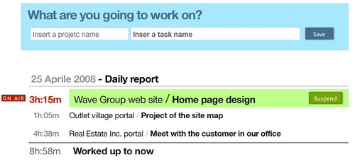
I tried a first design of people daily report, and seems to work quite good:
In the next few days I'll be working on "re-thinking WorkOutLoud" a bit. There are some cool and simple functions to evaluate, stuff like "Suspending & Resuming tasks", "Signaling or appending open issues to a project".
Nov 29, 2008
Mix CSS and images on a web page
Designing a web page can be really easy, but when you have to implement it using XHTML, CSS and pictures, to get a perfect mix, it’s a lot less easy. Also a small part of your page can become really difficult to build in, especially if you want to get exactly what have been designed with a graphic design tool. One of the tough tasks is to mix up correctly colors in the CSS and in the pictures you have included in your pages.
Today I will discuss how to correctly include a picture in a text page making it completely integrated.
There are some considerations to be done and rules to be followed:
Colors. The same color is displayed differently on a style sheet compared to a picture.
Browser. The same color can be displayed differently on different web browser
Formats. Pictures can be stored in different formats, such as jpg, png or gif. Different picture formats make the same color looking slightly different. So, you have to make use of the same format for all the images you put on your web pages. It's really important, especially if the colors you are using are not "web safe".
If you are forced to use pictures and a style sheet tightly integrated on a page, you have to decide how to make their colors displaying identical. Let's go through a small sample.
Working on WorkOutLoud I had to implement this portion of a page:
In the previous image there's a portion on the right side where the light blue rectangle change shape and goes over the beige rectangle:

Now, this design have been made using Apple KeyNote in a few minutes. It didn't take time to me decide that the metaphor I used was ok and that it looked pretty nice too. In my CSS the two rectangles were colored using the "color: " attribute, and the arrow shape was an image. So as a first solution I tryed with an arrow shape transparent on blue side - in order to get the same blue from the background of the rectangle - and the beige side colored directly on the image. In this way I got something like this:
The final result was not really good: the beige side of the arrow image was looking differently from the beige on the backgorund. Of course I could try the other way around: leaving the beige side transparent - in order to get the color from the background rectangle - coloring the blue side, but I could assure you that I would get the same result.
The real problem is that colors appearance strictly depend on the render method you apply to show them up.
So, how do you solve this kind of problems? How do you correctly merge styles and images?
Actually is really simple, and many of you already know the answer. In a case like this the image has to win, and the best thing you can do is coloring the beige rectangle using the "background-image" attribute in this way:
...
background-image:url(one_pixel_beige_image.png);
background-repeat:repeat;
...
Of course the "one_pixel_beige_image.png" must be a pixel with the same color as the beige side of the arrow image.
This small trick solved my problem.
Nov 22, 2008
MacBook Air thoughts
I finally bought a MacMoob Air. I was waiting for Apple announcing a review of the very first model, with the capability to be connected to a 30" Apple Cinema Display . It's wonderful on any aspect: it's beautiful, it's light, it's enough disk space to work well, it's fast, the display is ... well ... good enough. It's a pity, but you know I was used to the 17" MacBook Pro which had a really good screen. The drawback of having a monitor not as good as you can expect is that some colors, especially the lighter ones, are not always showed at best.

Watching WorkOutLoud design on MacBook Air I noted that the light blue I was using in the header of my page was showed as white.
So I made a small review and this is the result:
This tiny nuance on the page header color will allow also to privilege people to have a good view of the application. Maybe it's something to take care in future.

![]()